Skip to content
  • Home
  • About
  • Logo meaning
  • Values
  • Contact

bene esse – well being

A community of people who want well being and a better world

  • Articles

Logo meaning

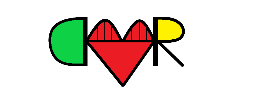
The green is for harmony. The red and the heart are for love. The yellow is for learning. The D is for Dignity. The R is for Respect and Relationship. The bridge makes the H for Harmony and also connects everything together.
Share this:

  • Share on X (Opens in new window) X
  • Share on Facebook (Opens in new window) Facebook
Like Loading...

Menu

  • Home
  • About
  • Logo meaning
  • Values
  • Contact
  • Articles

Search

Archives

  • January 2021
  • February 2019
Blog at WordPress.com.
  • Subscribe Subscribed
    bene esse - well being

    Have a WordPress.com account? Log in now.

  • bene esse - well being
    Copy shortlinkView post in Reader
    Manage subscriptionsSign upLog in
    Report this content
    Collapse this bar
Loading Comments...
%d